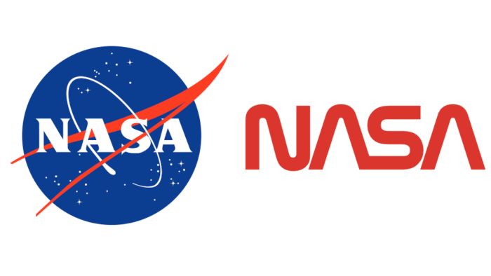
NASA มีโลโก้อยู่ 2 แบบคือ โลโก้ต้นฉบับที่เป็นวงกลมสีฟ้า (ในวงการเรียก meatball) และโลโก้ที่เป็นตัวอักษรคำว่า NASA สีแดง (เรียกว่า worm คือขดๆ เหมือนหนอน) โดยโลโก้แบบหลังเรามักเห็นแปะติดอยู่ข้างจรวด แต่มันถูกใช้แค่ช่วงปี 1975-1922 เท่านั้น แล้วถูกยกเลิกกลับไปใช้โลโก้เก่า
อย่างไรก็ตาม โลโก้ worm ถูกเลิกใช้ไปนานแล้ว แต่มันกลับฮิตมากในหมู่ pop-culture (โดยไม่มีเหตุผลอธิบายชัดเจนนัก) จนถูกนำกลับมาใช้อีกครั้งในภารกิจของ SpaceX ปี 2020 นี้เอง
เว็บไซต์ Fast Company มีบทความพูดถึงความนิยมของโลโก้ worm จนถูกนำมาใช้ใหม่ โดยไปสัมภาษณ์ผู้ออกแบบโลโก้นี้ด้วยว่ามีมุมมองอย่างไร
เหตุผลอย่างหนึ่งที่อ่านแล้วเข้าท่าคือ โลโก้ worm ถูกออกแบบตามหลักการโลโก้สมัยใหม่ ที่ “ทนทาน” (withstand) ต่อการนำไปใช้ในจุดต่างๆ ไม่ว่าจะเป็นหัวบิลเก็บเงิน หรือ บนข้างจรวดก็ตาม ในขณะที่โลโก้ meatball (ซึ่งออกแบบมาก่อนหน้านั้นนานมาก) ไม่ได้ออกแบบมาด้วยแนวคิดแบบนี้
it also gives the logo profound versatility. “The designer population probably understands how it needed to work on the piece of paper, on a letterhead or an invoice, and also on the side of a satellite, and how it needed to withstand those different applications,” says Reed. “The meatball isn’t designed to withstand the types of design considerations that graphic designers think about.”
ประเด็นอื่นๆ อ่านแล้วก็ได้ความรู้ดี แนะนำ